A hands-on practical guide on how to get started working with design tokens and Stratos Tokens — the designer’s perspective
In this tutorial we’re going to do something different, we’re going to divided this practical guide into two articles:
- The designer’s perspective (this one)
- The developer’s perspective (Fredriks upcoming tutorial)
I’ll be creating the design tokens needed to control the styling that we use in both Sketch2React and Stratos Tokens apps straight from within Sketch. Then later, in part two, Fredrik is going to use these design tokens (autogenerated SCSS from Stratos Tokens) and implement them in code. Fun!
Follow the project
If you’re interested in following our process of building a minimal design system make sure to follow our project on Github 🏋️♀️
First some basics
Design tokens are design decisions right? Let’s take a basic example, so we understand each other from the get go:

Take the above simple button as an example. Without even noticing we have already made these design decisions:
- Color
- Border color, weight, and radius
- Typography
- Padding
As a designer you are actually already working with design tokens but, most likely, without being conscious about it, without having a methodology.
Practically working with design tokens is about deconstructing these design decisions into different parts, a bit like looking into the blueprints of a classic Volvo V70 engine.
Sketch2React Style Guide
For this tutorial, I created a simple style guide for our apps, it looks like this 👇This is the first time I take a general look upon the styles that we are using. Not all of them are used everywhere, which is the whole purpose of style guides. They are guided, not mandatory.
The strong use case for Team Sketch2React
Team Sketch2React is a small team consisting of one designer (me) and one developer (Fredrik). We have full-time jobs on the side of running our little software company, so we really need to be smart on what we work on, and how.
You could call us a 100% remote software company since we don’t even see each other in person anymore. Damn you Covid-19!
We talk though, several times a week, of course. On one of these talks Fredrik suddenly said:
” Juan, wouldn’t it be a really cool demo for Stratos Tokens to actually update the styling for our apps with it?”
Now this is getting interesting! Not only can we use this as learning material, we will also benefit from this setup. I can create & update the design tokens straight from Sketch, send Fredrik a neat little package of styling data (in our case autogenerated SCSS via Style Dictionary) and boom, he consumes them in both our apps. Is it Christmas already? 🎄 🎅
Theming!
Not only will I, in my role as designer, be able to get nitty-gritty about all those petty small details I care far too much about. We have also talked about creating several themes for our apps, both for dark mode and the default light one.
Now instead of bugging the hell out of poor overworked Fredrik I can style everything myself, experimenting with different themes, and he can focus on building support for switching between them in our apps settings.
Design tokens can be used for anything
I think that many designers think design tokens is something to solely be used together with and within design systems. This is a dangerous misconception holding many teams away from ever implementing them.
You don’t need to have an entire design system at hand for it to be worth the little extra time and effort it takes to set this up. Even handling visual updates between two apps (Sketch2React and Stratos Tokens) is time-consuming.
What if I could, as a designer, do some heavy lifting and take care of the styling?
You already know the answer. So, how do we start?
Step 1 — Design token audit
The first thing we need to do is to look at our apps and do a design token audit. Not all things need to be updated via design tokens. As a kind of MVP for this new workflow we decided to create color tokens for:
- Fonts 👉Light & Dark Mode
- Icons 👉Light & Dark Mode
- Backgrounds 👉Light & Dark Mode
- Buttons 👉Light & Dark Mode
- Panels 👉Light & Dark Mode
The best thing here is, if we need to create new design tokens for new components, we just add them to our design file Sketch or Figma 👉Stratos Tokens 👉Style Dictionary Magic 👉Export ✅
Anyone heard someone scream S C A L A B L E outside my window? No?
Okey I need to cry tears of joy now.
Step 2 — Get the current styling code from Fredrik
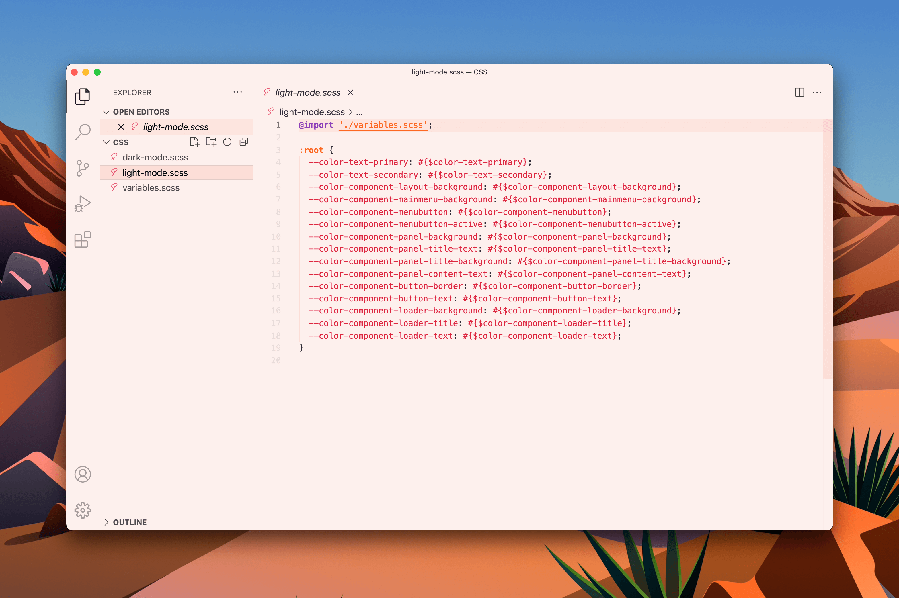
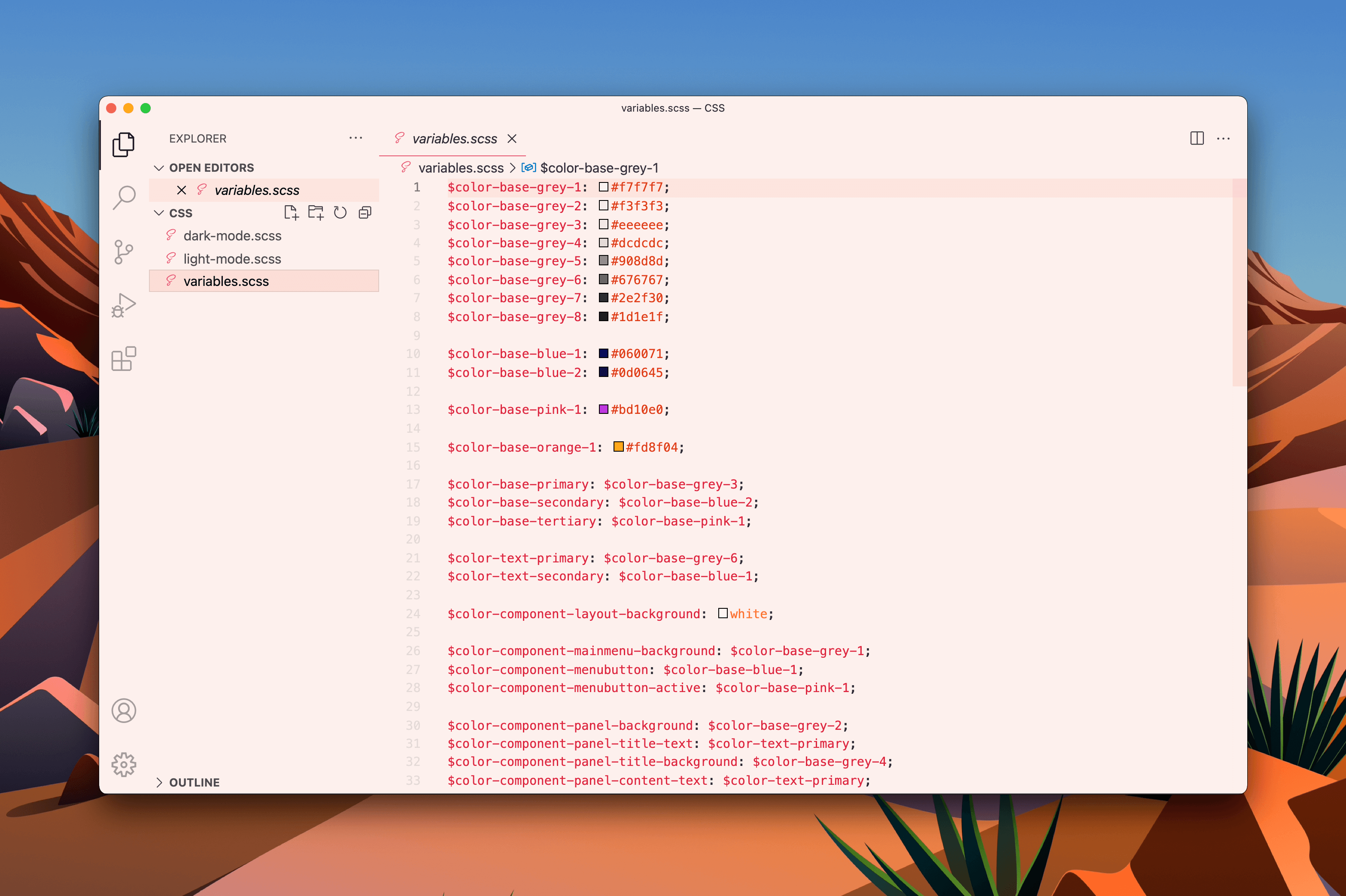
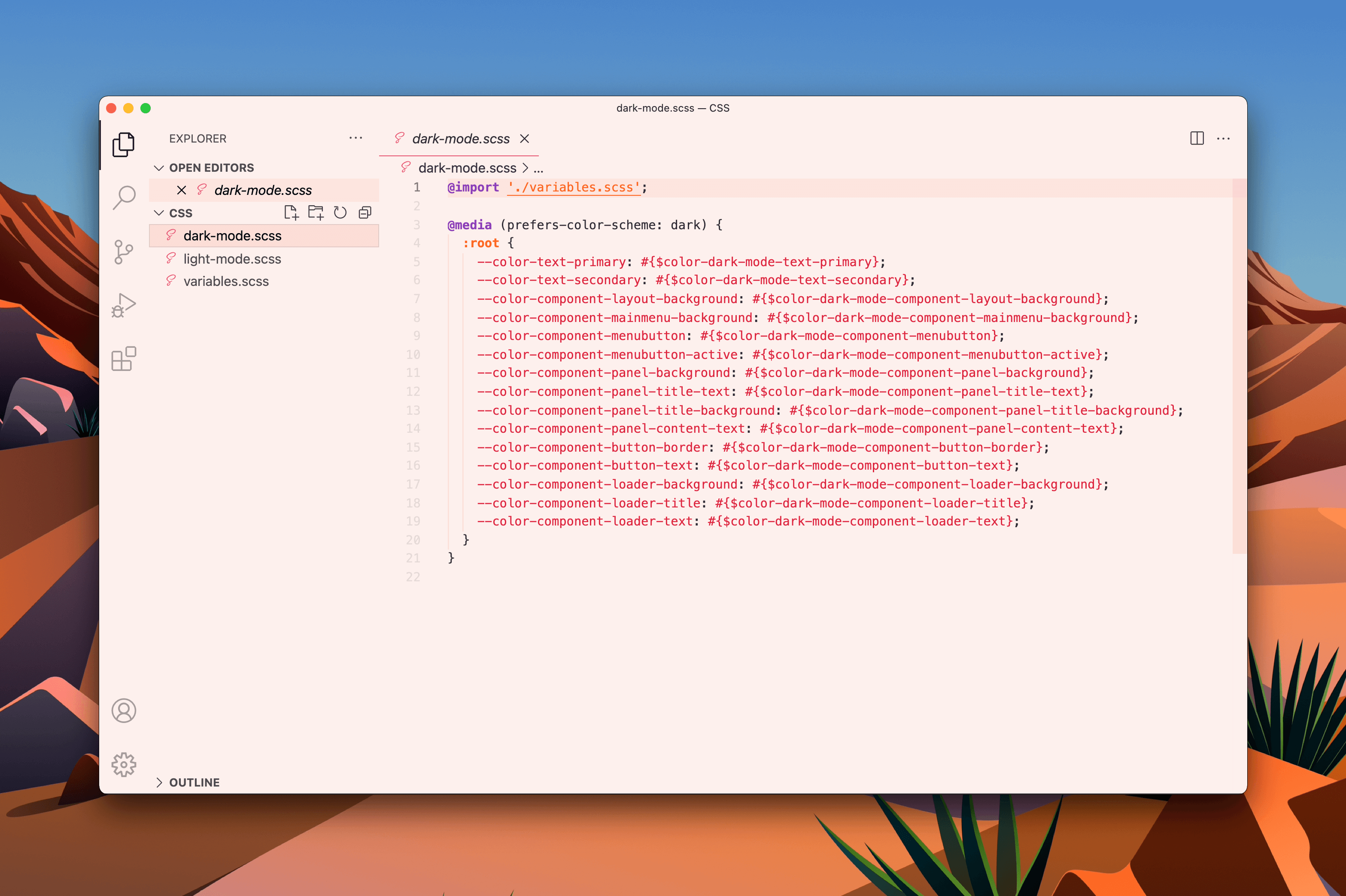
Both our apps are built with Electron, so we use SCSS for all the styling. Currently, we have three SCSS files 🕵️♀️
- variables.scss
- dark-mode.scss
- light-mode.scss
As you probably can see Fredrik has already done an impressive job for us, everything organized into the same CTI (Category, Type, Item) that is the base of how Style Dictionary works.
Just a quick comparison of the three SCSS files teaches us these important things:
- All important stuff is inside variables.scss
- The other ones use references to variables.scss
This means we only need to create the color tokens that are used inside varibles.scss in Sketch. Let’s do that now!
Step 3 — Lets recreate the variables inside Sketch
Side note 👉 These steps will be the same when we release our Figma support, which is coming later in Q2.
In my not so humle opinion one of the top features in the new Stratos Tokens 2021 is the way we handle what comes out in code and not. Everything that is not wrapped with {curly brackets} will be ignored in our app. This opens up for a cleaner output and enhances your workflow inside Sketch (and later also Figma).
In Sketch
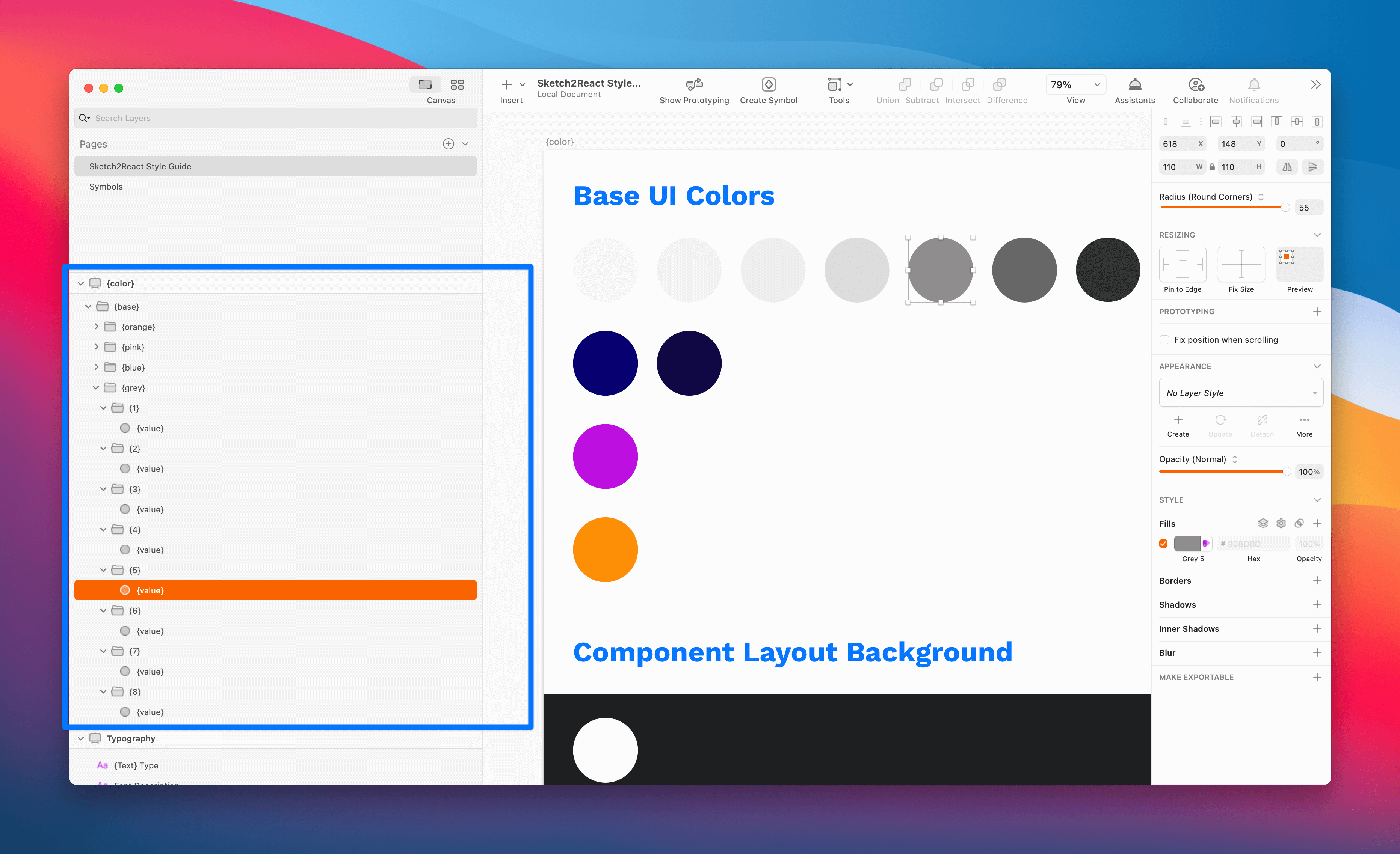
- Let’s create a new artboard inside our Style Guide and name it {color}.
- You can jump ahead and study the final Sketch file
How did I know what to call the artboard? I studied Fredrik’s nicely organized SCSS. ✅
What if my developer hasn’t organized it like this in code?
Doesn’t matter at all. If you follow Style Dictionary’s CTI structure and naming conventions what comes out in code from our app will work everywhere. Upon building these tokens, thanks to the genius of how this works in the back-end, all your {artboards} and {tokens} will merge into a single SCSS file.
Style Dictionary also exports by default to iOS and Android without you needing to do a single extra thing (if you set it up correctly of course).
When you have become accustomed to how Style Dictionary works and what CTI is, it’s a piece of cake to build this inside your design app.
The hierarchy in Sketch
- {color} name of the artboard
- {base} name of parent group
- {grey} name of child group, in this case all the grey colors we use
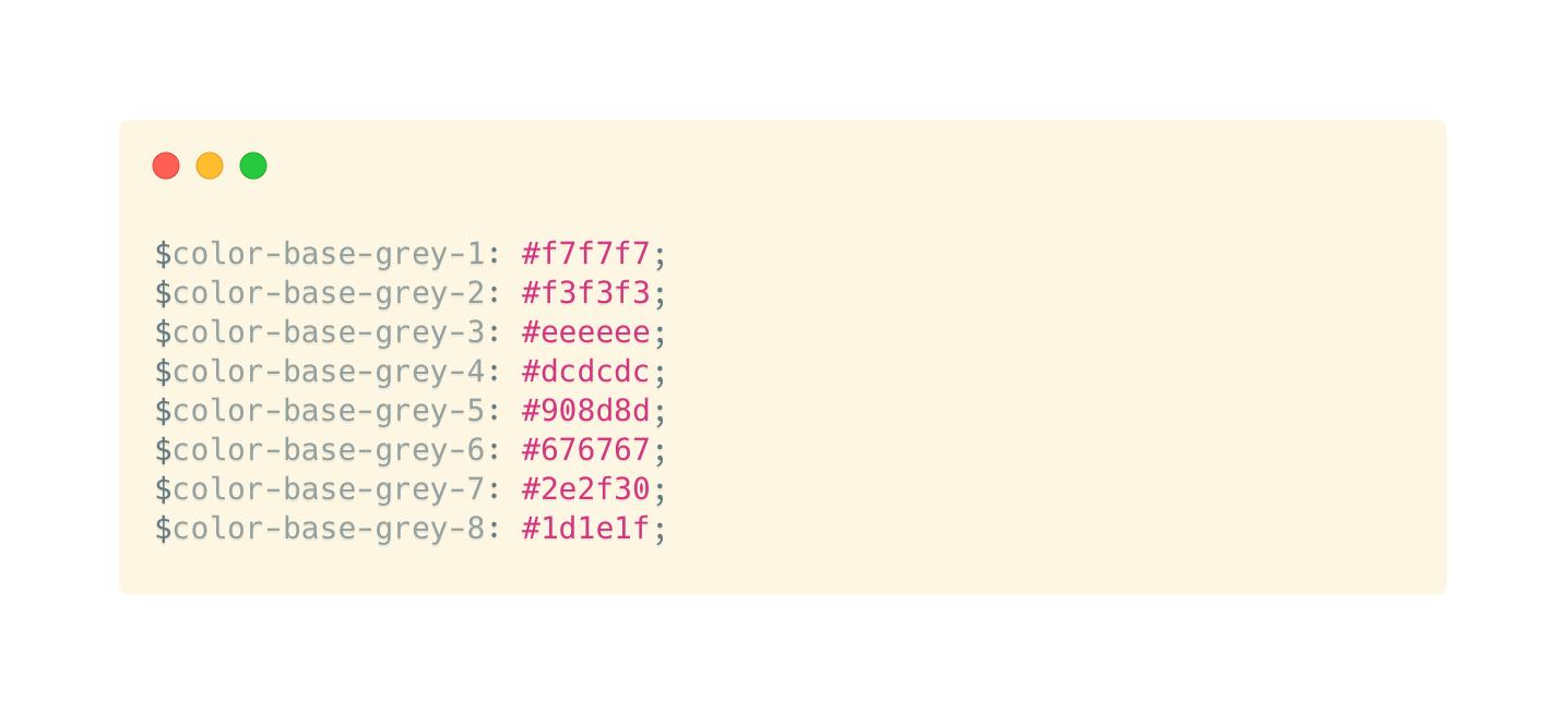
- {1} name of child group, in this case it refers to this color #f7f7f7
- 👉For colors you use rectangles, call them {value} and fill it with the color code
- 🚀 ✅
Looks like this
Use a prefix
To better separate the design tokens that you create from the original styling code we strongly advise you to use a prefix. The coolest thing is, you only need to add a single line of code to your default config.json that we automatically create for you for new Stratos Tokens projects:
"prefix": "token",
This will make more sense when we add this Sketch file to Stratos Tokens. Let’s do that right now.
In Stratos Tokens 2021
Side note ✍️ Since we’re only using one artboard that renders design tokens, for this tutorial you can use the free demo of Stratos Tokens 2021 😺💪
You add design token artboards by using {curly brackets} … That means you can have unlimited regular artboards in your document.
- Download my Sketch file for this tutorial
- Drag and drop it onto the Sketch file loader (that animated Sketch logo thingie)
- Save Stratos project
- Done! ✅
So let’s look at what we have created for you:

Looks good. Let’s jump right into our config.json file and do these two things:
- add a prefix called
tokens - change the name of the destination from
_variables.scssto be insteadvariables.scss
Why change the destination name?
If we look at one of the SCSS files that Fredrik sent to me, it looks like this:

See right on top it says @import './variables.scss'; with no underscore. It actually doesn’t matter much since your developer can relink things anyway, but I want to keep this demo 1:1 with how Fredrik’s styling code looks.
Original config.json
"platforms":{
"scss":{
"transformGroup":"scss"
"buildPath":"styledictionary/build/scss/"
"files":[
0:{
"destination":"_variables.scss"
"format":"scss/variables"
}
]
},
Updated config.json
"platforms":{
"scss":{
"transformGroup":"scss"
"buildPath":"styledictionary/build/scss/"
"prefix":"token"
"files":[
0:{
"destination":"variables.scss"
"format":"scss/variables"
}
]
},
Make sure you open up the config.json in an external text editor, we always use Visual Studio Code for obvious reasons. It owns.
Awesome! Let’s take a ☕break, if you have made it this far, you must be pretty tired by now. I know I am 🤣
Let’s do some Style Dictionary magic
Now that we have worked really hard for 30 minutes or so, let’s see what all the fuzz about that damn Style Dictionary is about.
- In Stratos Tokens app 👉View 👉Project in Terminal
- In Terminal app 👉
npm installand hit Enter↩︎ - In Terminal app 👉
npm run buildand hit Enter↩︎ - Now go back to Stratos Tokens app, press the little refresh icon:

- Done! ✅ We have just autogenerated all the SCSS, added a prefix to each token name and all is well, looking good.
It’s now that the real fun begins. Let’s add a few new design tokens shall we?
How our apps look today
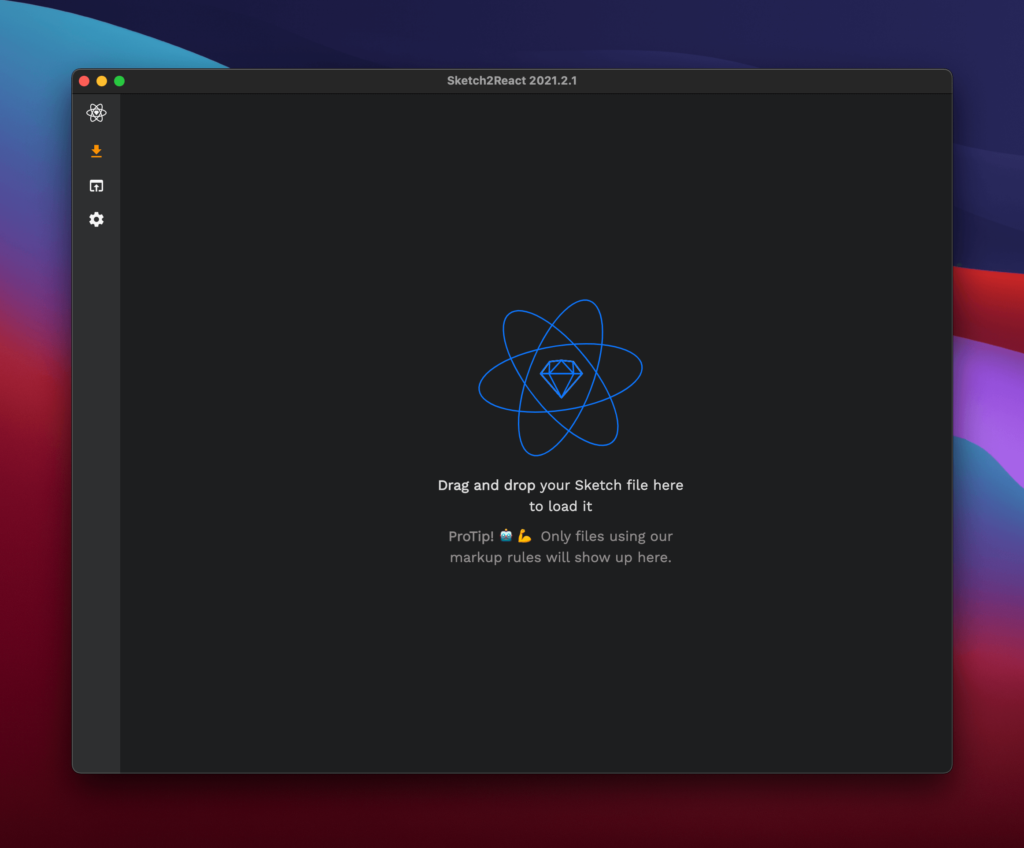
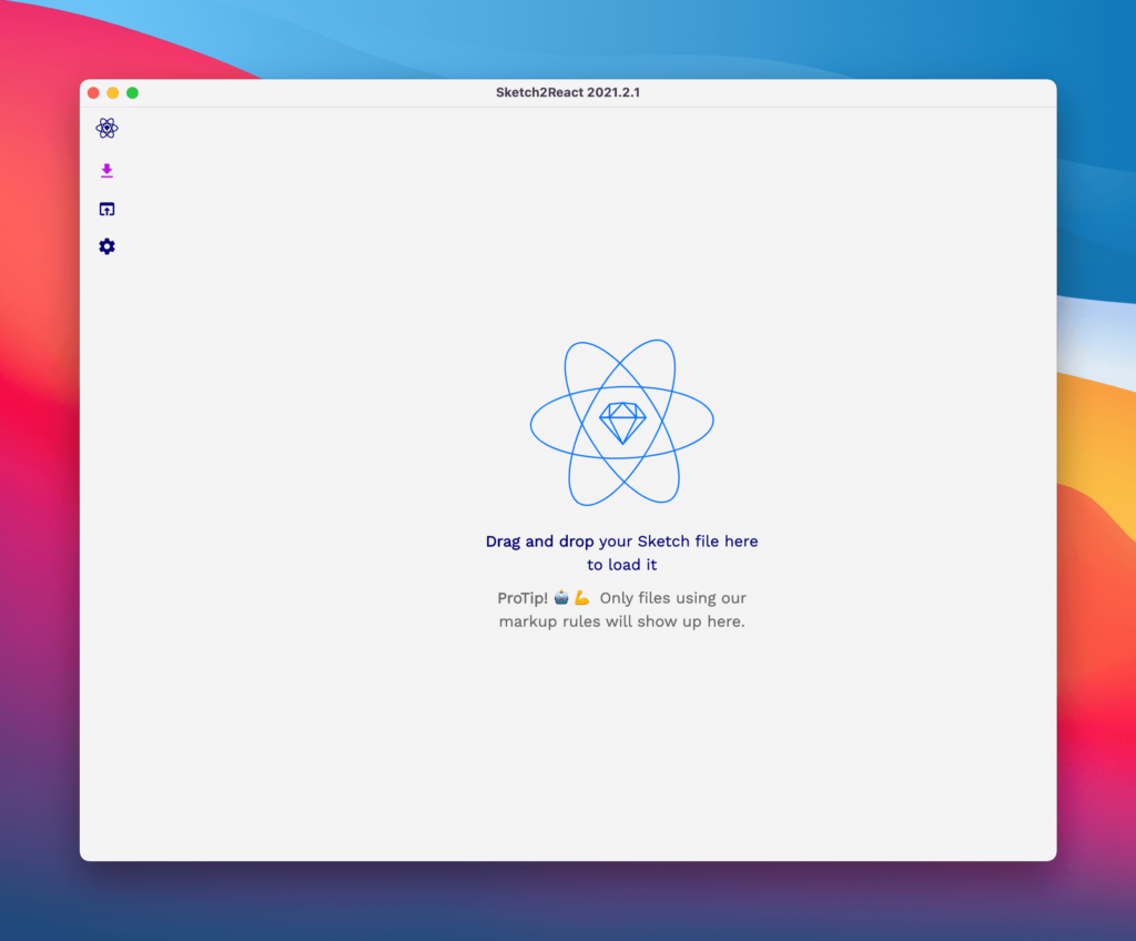
In both Sketch2React and Stratos Tokens the selected section icon colors look like this:
I’m not 100% happy with this even if I’m the one who actually chose them from the very beginning. No problems since now we have a very fast way of updating this. 🚀
I want to try out two new colors, two different blues.

Since it makes no sense changing the colors of color-base-pink-1 and color-base-orange-1 I will instead do this:
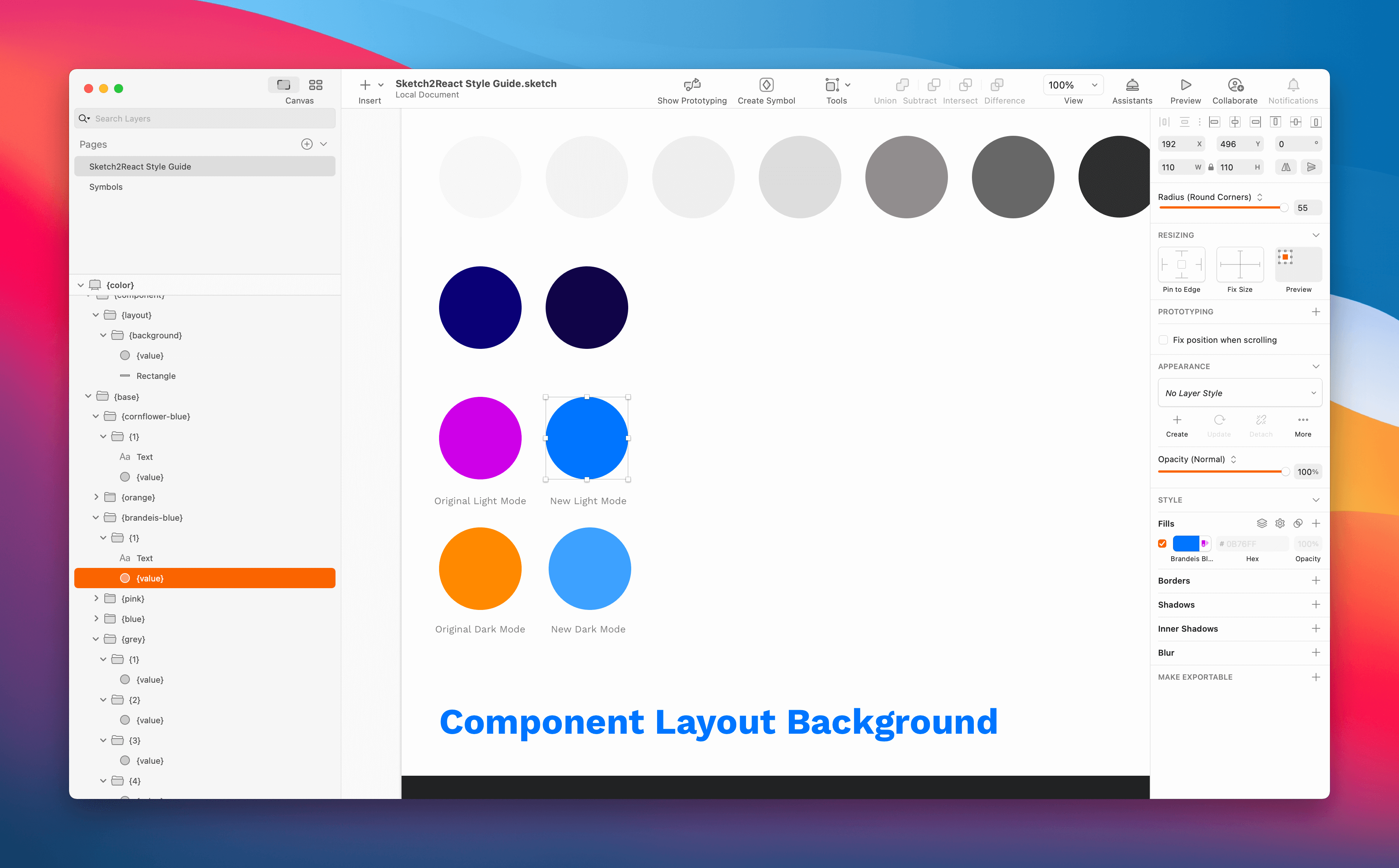
In Sketch
- Duplicate the layer groups containing above design tokens
- Rename them to something that actually makes sense (blue-something)
- Change the {value} to the two new shades of blue
Since I also want to show Fredrik what I have changed, I’m going to add them right beside the current color used in our apps. Maybe I’ll add some explanation texts also? Hmm, let me see.
I have a confession to make. I’m really terrible at coming up with names for my colors. So, I just picked the name’s auto-created by my neat little color tool called Sip. Really, I recommend it. 🧡
In Stratos Tokens
Let’s rebuild everything again, but this time we don’t need to do the installation command.
- In Stratos Tokens app 👉View 👉Project in Terminal
- In Terminal app 👉
npm run buildand hit Enter↩︎ - Now go back to Stratos Tokens app, press the little refresh icon
Voilà look at our delicious color tokens!

ProTip! 🤖 💪
I’m saving all my different colors as variables in Sketch. That way, if and when I update any of them, it will also update my design tokens if in use. Talk about neat feature.
Let’s send this to Fredrik aka The Developer
That’s it! Now we are ready to send this too Fredrik and see what he does with it.
- Zip my entire Stratos Tokens project folder, in this case mine is called Sketch2ReactStyleGuide
- Send it to him via Slack in a PM
- Let him take care of everything from now on ✅
That’s all folks, hope you enjoyed this practical guide, I had a blast. It’s going to be fascinating to read the follow-up article from Fredrik’s perspective, the developer.
