
Let’s break down the two different ways of working with design systems and Stratos.
Styled Components
Every time that you use our markup correctly you will output Styled Components automatically.
The easiest styled components you can create is anything that has to do with typography. Here’s for example how you create an H2 in Stratos:
- Use the Text tool in Sketch (T) to style a nice H2
- Choose the font, the size, the colour
- Make sure you add {H2} to the layer name, like this: {H2} Layer Name
- Done!
- Now if you create a new Stratos project and include the .sketchfile you will be able to see this code in the Component Inspector ??

Here’s more about Styled Components from this great article from the publication Better Programming:
“Styled components allow us to keep the styles within the component, coupled with the JavaScript code.”
In other words, Styled Components can be referred to as the code equivalent of symbols in Sketch. You design & build them once, and reuse them everywhere you need them. Pretty amazing, and that’s why we rebuilt our rendering engine Tropos to output them.
That is also simply put the biggest difference between Sketch2React (no styled components) and Stratos (styled components)
You can also work in a totally different way in Stratos.
Enter the world of design tokens & themes.
Design Tokens & Theming
What are design tokens then? I found this great article on the topic, Design tokens for dummies.
Here’s another great article that describes it really well:
Think of each token as a relatively static value representing a design decision.
Fine thing is, you can now work with both design tokens, themes & styled components straight from inside Sketch by connecting Stratos to your workflow.
Design tokens require you to structure things a bit differently. Here’s a screenshot of a work in progress Design Tokens Cheat Sheet.
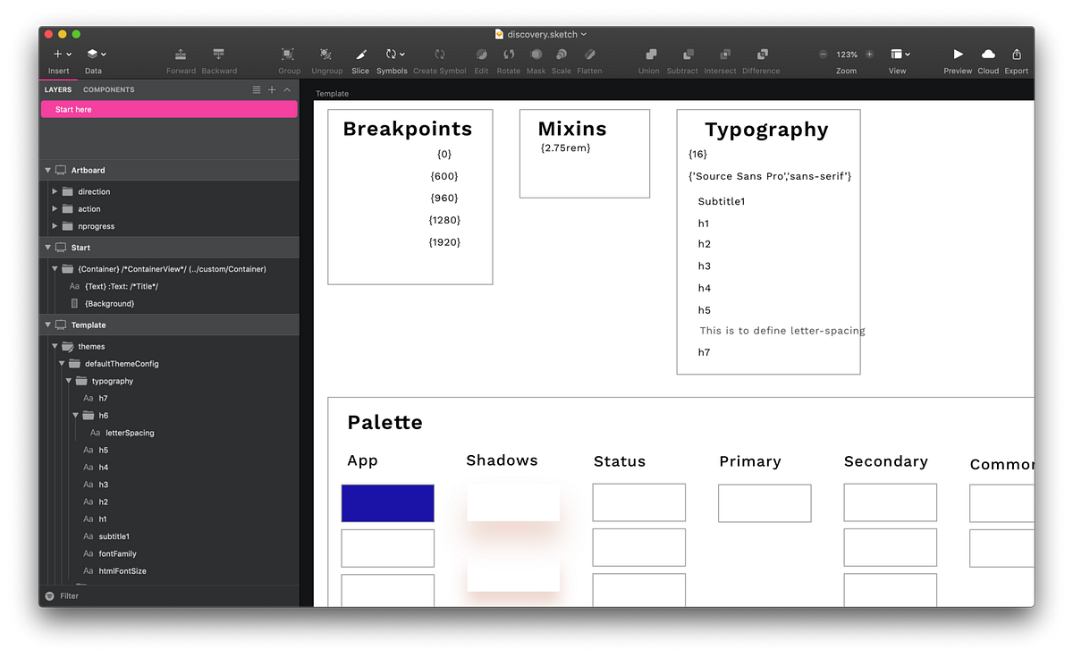
You need to think even more in terms of system design. The whole philosophy of design tokens is that they are just tokens that point to a real code base. A code base that can be, as in our example, based on Material Design UI.
Design tokens are not bound to a certain code library either, that’s one of the strengths with it. So you can be using whatever you are using on the code base of things. Which is very powerful indeed.
Actually, the things you actually can do straight from your design app are kick-ass.
- Add and update Typography
- Add and update Colors
- Add and update things like shadows, bevels and other effects
Fear not dear reader, we will of course share our Design Tokens Cheat Sheet when it’s ready but the real work will be done by you & your developing teams.
That’s it for now!
Hope you enjoyed this very brief view, at two different approaches for building your design systems with Stratos. ?✅?
All the best
Juan Maguid, Team Sketch2React