In this tutorial I’m going to explore the scenario where you have built something in Sketch with Sketch2React and used our Capacitor 3.0 export for creating iOS projects. In itself really amazing, but you feel you could do more. Always push for more as a designer, right? This is going to be fun!
Requirements
This tutorial presumes a few things:
- That you know how to build in Sketch for Sketch2React
- That you have Sketch2React 2021
- That you have done the prequel tutorial and installed all the nice things you need in this one
Download the Sketch file
Here’s the Sketch file for this tutorial plus the custom CSS I’ve created that removes the default Bootstrap link hover thingie, plus a bit of CSS for rounding all of the images nicely. Important 👉You will need to relink the {externalasset.css} for the custom css from mine to yours or it will not work. Not sure how? Download our free ebook and search for {externalasset.css} and you’ll find all the help you need.
A little disclaimer
I’m a total noob when it comes to iOS development. Web code I grasp and understand. Swift? What? Yes, exactly…
All the things I have learned so far have been by making a million mistakes, not reading the manual and googling stuff here and there, just trying again and finally getting something that is representable. It’s just the way I learn.
This will be my third tutorial focused on the theme From Sketch to Xcode — the No Code Way and still, I haven’t been forced to write code. I have nothing against code of course, everything that I have done have been about creating code but just in a way that suits me, by autogenerating as much as I can with smart tools.
With that out of the way let’s go brave explorers of the unknown.
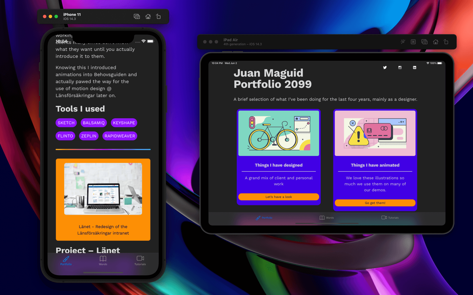
We are going to build this
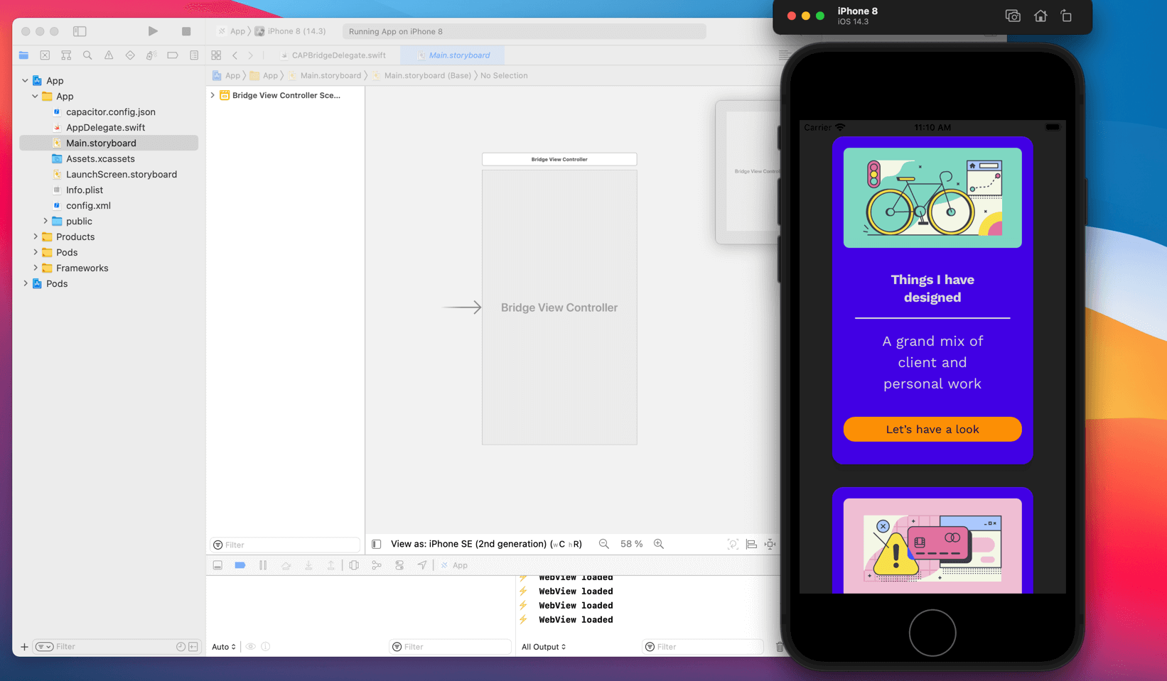
First lets look at what we have
This is how the project looks after I have followed all the steps from my tutorial and opened it up in lovely Xcode. Really nice and amazing that you can do this straight from Sketch and Sketch2React.
Interesting findings
I have experimented with this a couple of times now and here are some interesting findings:
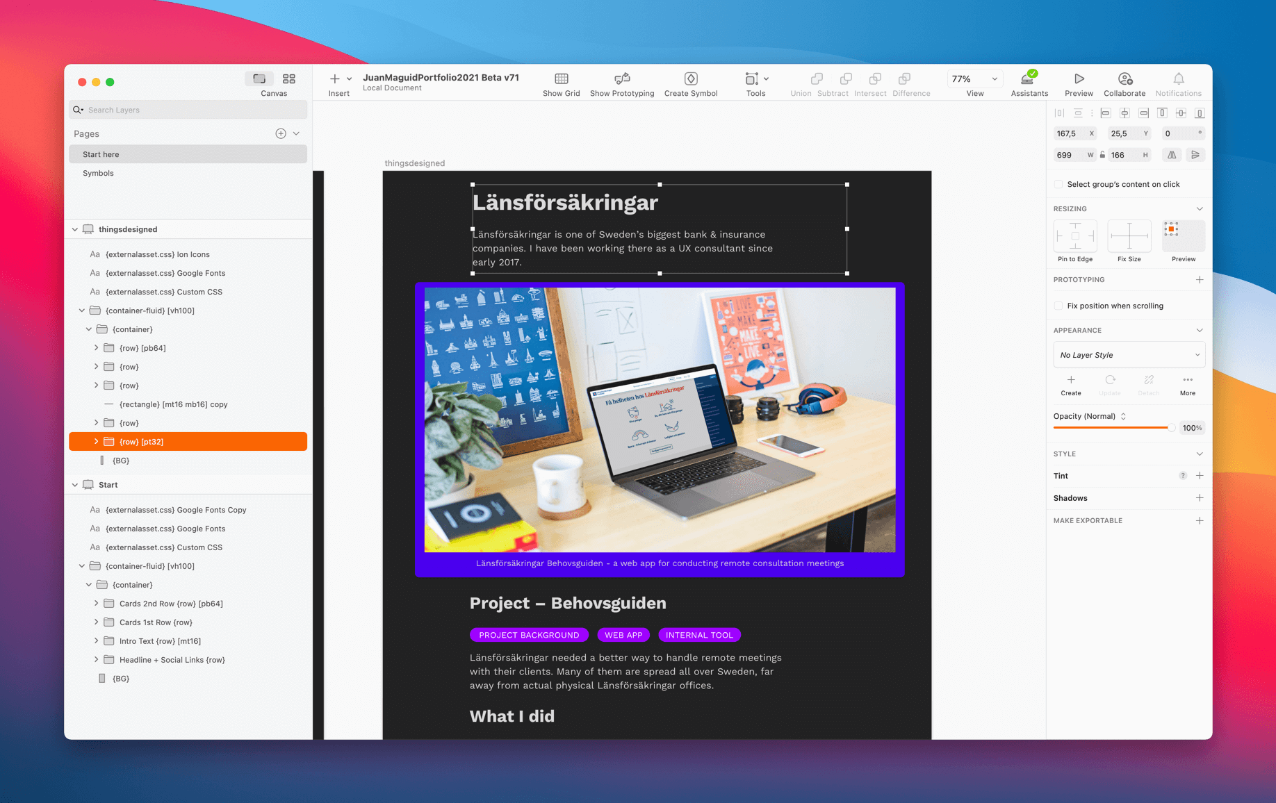
- Since we’re adding a native UI element on top of the Capacitor layer in Xcode we need to add a bit of padding in Sketch both to the top and the bottom of our content
- When you do changes to the Sketch2React HTML (and you will do this a couple of times, trust me) you don’t need to export as Capacitor project again
- Just export as HTML project and copy + replace the older file. I usually don’t need to update the images, so the ones I replace are these 👇
- Of course, if you add new images you will need to replace all of them. Just don’t forget to compress them once again using something like TinyPNG 🧡
- Don’t forget to run the command
npx cap copyinside your project after you have replaced the old HTML files with the new ones
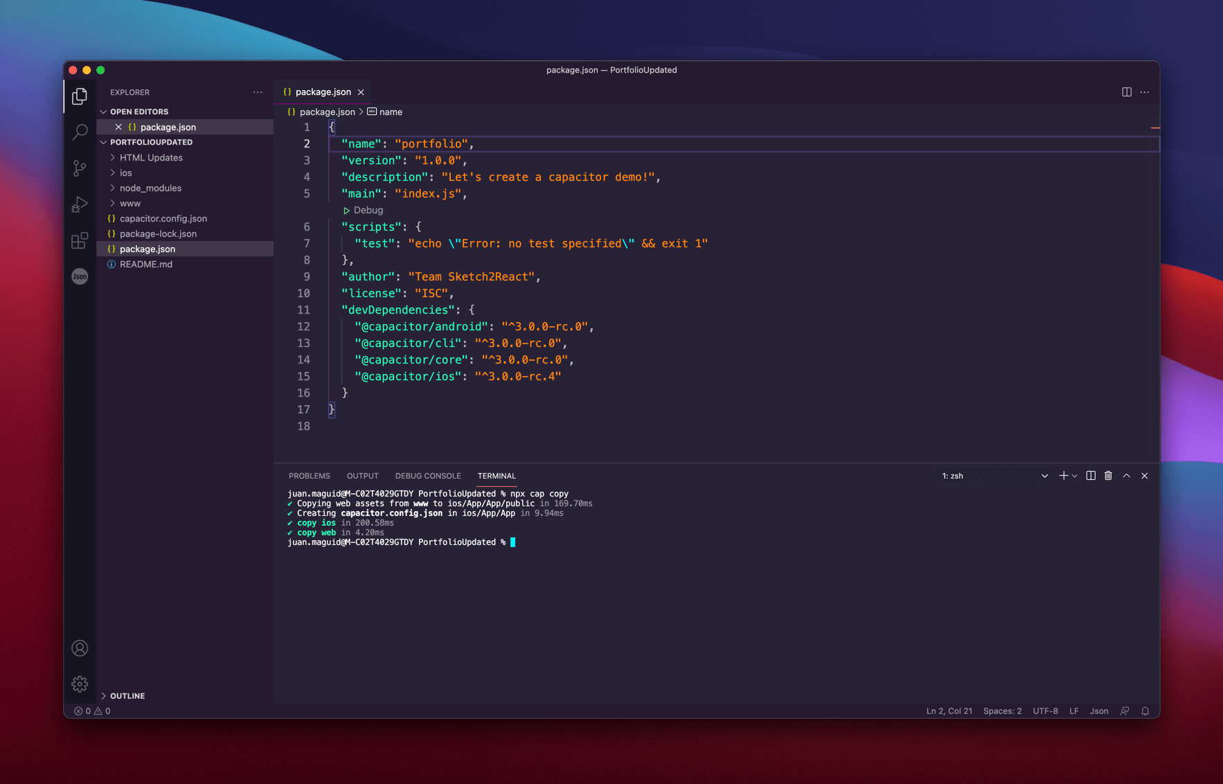
Cool, now we are ready to step up our game. Let’s add a native iOS component called Tab bar 😺
In Xcode
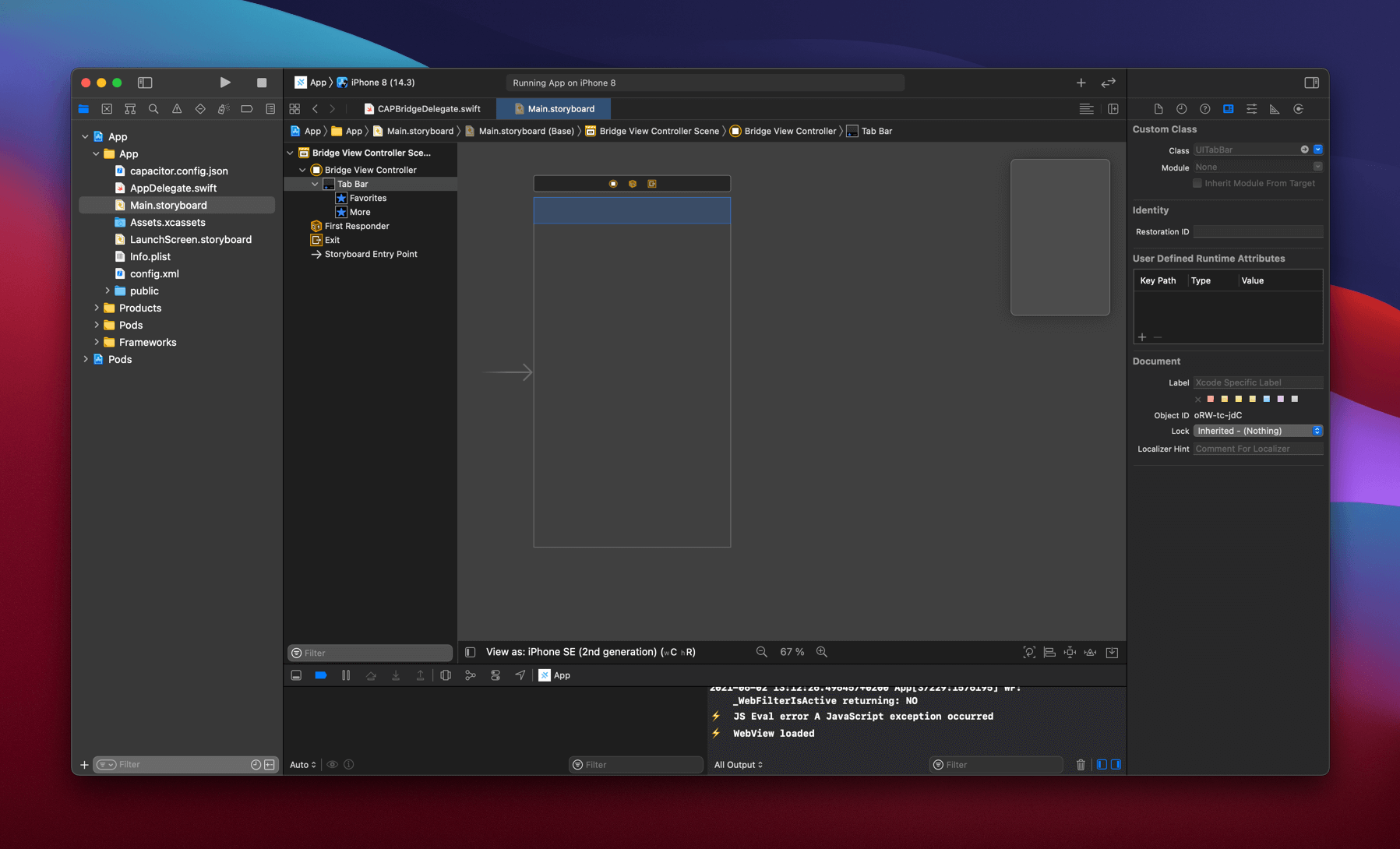
- Make sure you are here 👉 Main.storyboard
- Use the shortcut ⇧⌘L to call up the Library
- Search for Tab Bar
- Drag the component called Tab bar onto the ”artboard” called Bridge View Controller
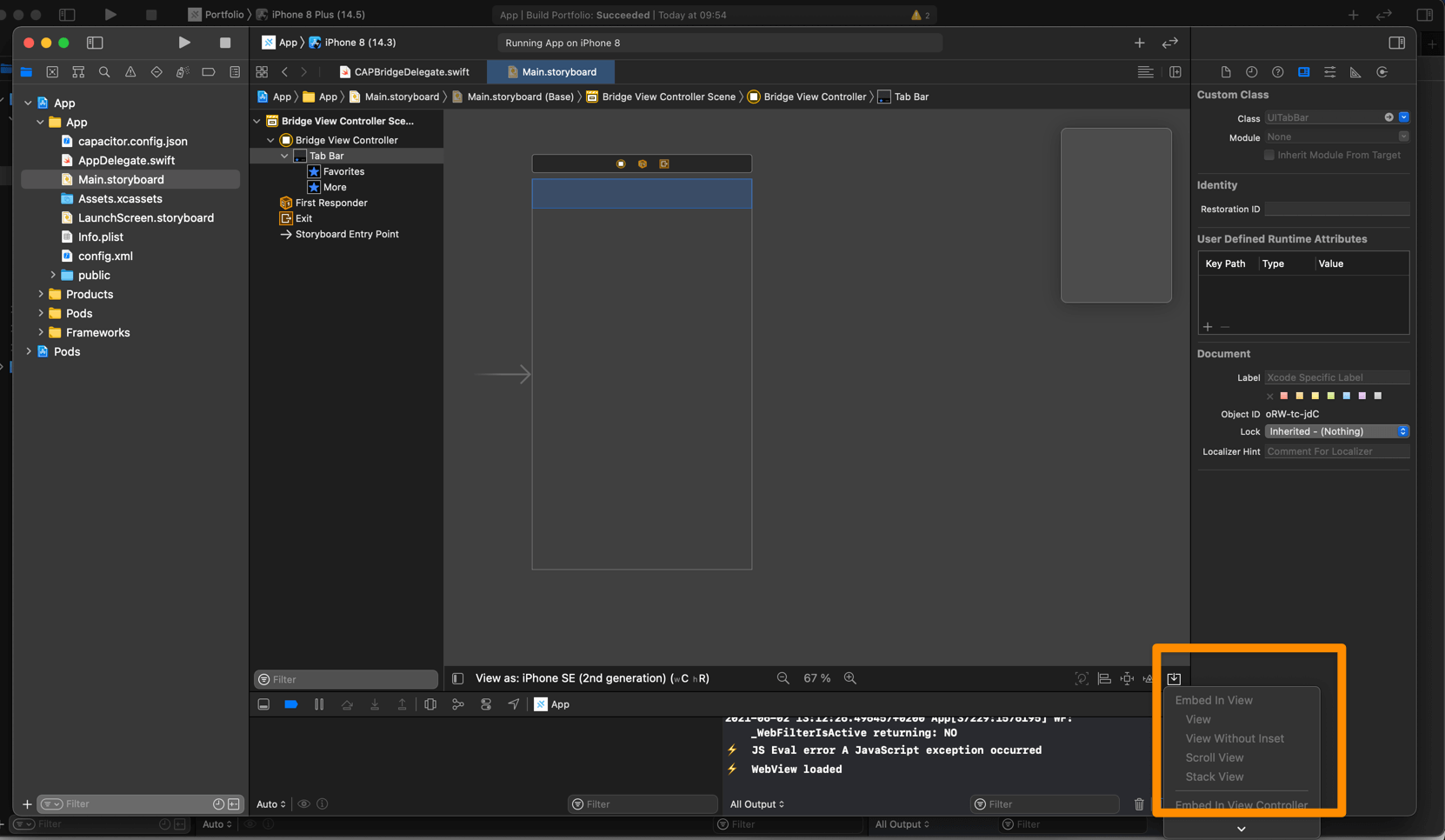
- See that tiny icon that looks like an inverted share icon? You need to go there and choose 👉Embed in View Controller 👉 Tab Bar Controller
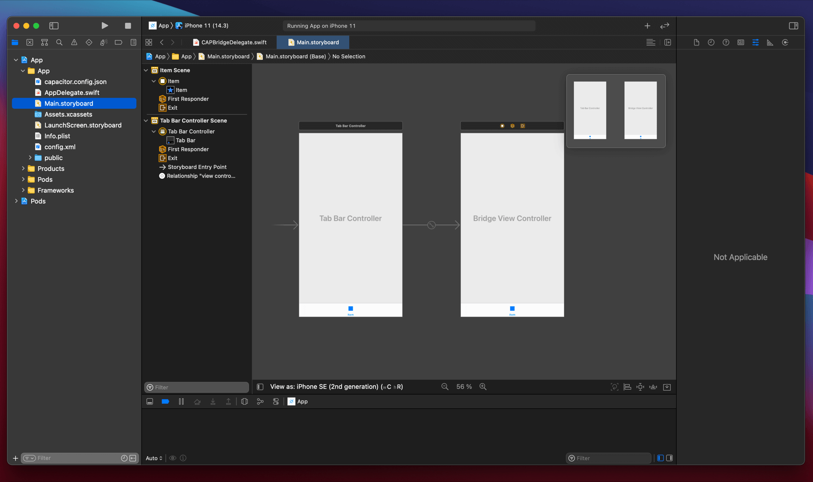
- Now it should look like this, and it’s actually starting to make more sense to me as a designer. This looks like in Sketch or Figma or whatever kitchen you prefer to make your dinner in.
Let’s build this and see how it looks inside a simulator of a iPhone 11.
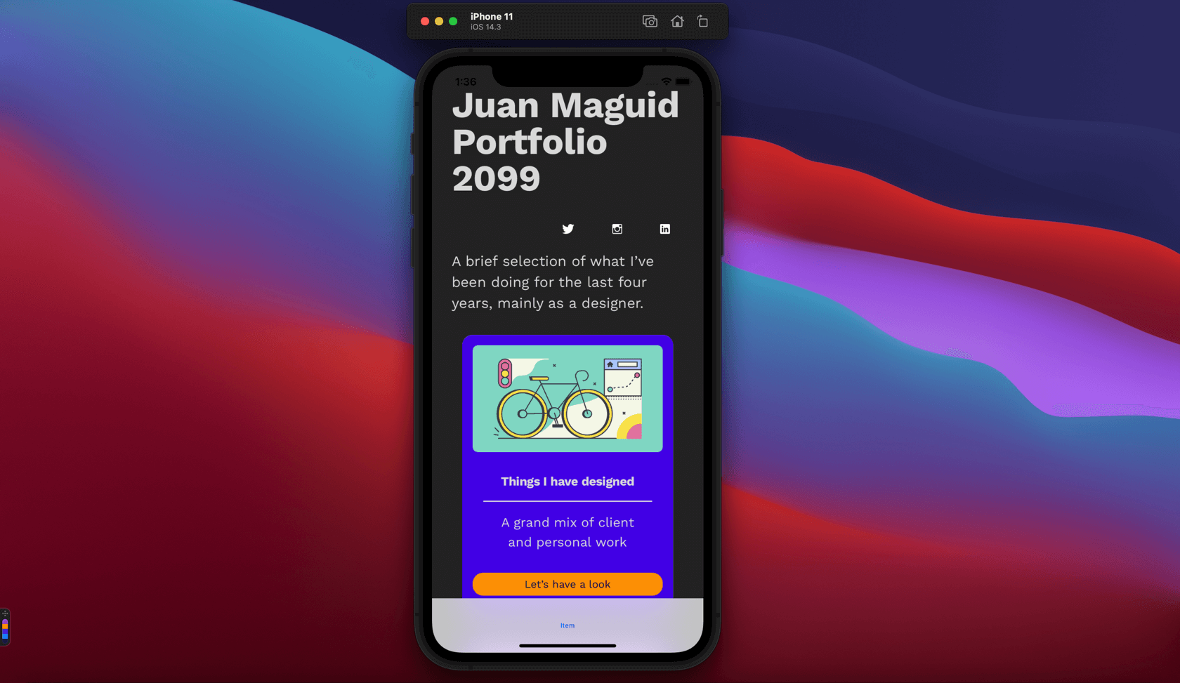
Let’s style our Tab Bar item 🖌️
First let’s take care of the naming of things. I renamed the View Controller to Portfolio, and then I renamed the Tab Bar item to, guess what? Portfolio! 😬
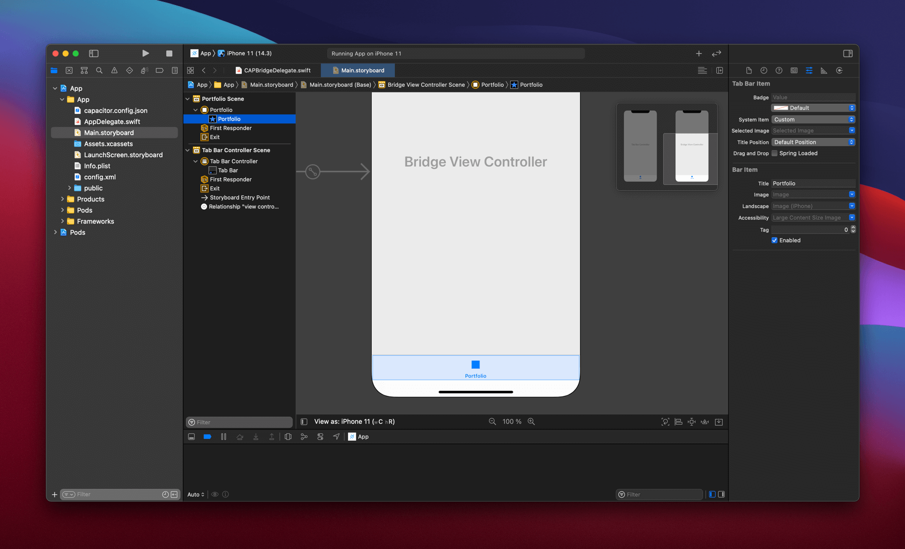
Just like working in any design application, naming things accordingly is always a great idea. If you handed this app to say an iOS developer for more advanced features it will become crystal clear what the different view controllers are supposed to contain.
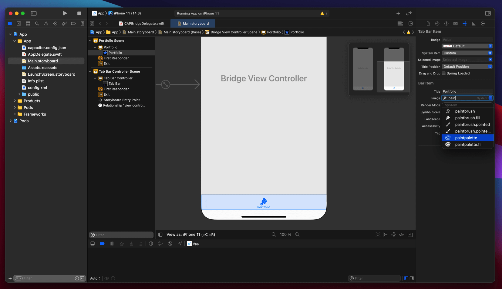
Apple SF Symbols
Xcode comes bundled with Apples own icon library called SF Symbols. You don’t need to install the separate app, although it’s a way easier way of viewing the icons that way.
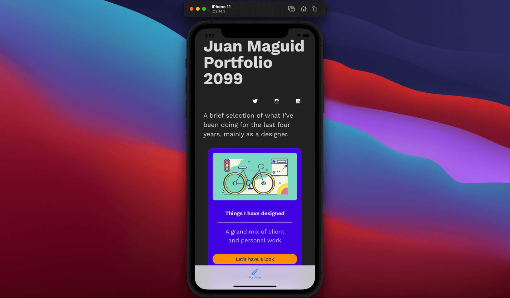
One thing I noticed when switching from the iPhone 8 simulator to the iPhone 11 is that the tab bar is a bit taller. This becomes obvious when I look at a subpage of my portfolio, which is rendered as a Capacitor layer inside Xcode.
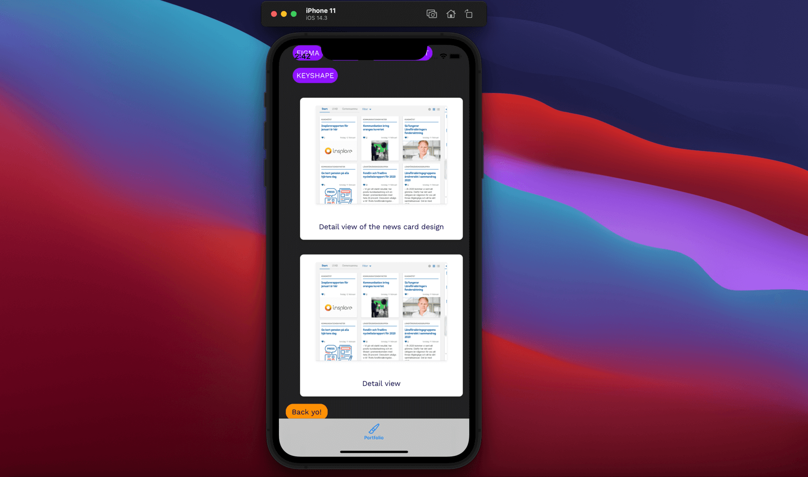
There’s probably several ways to resolve this issue for an experienced iOS developer but since I’m not, let’s fix this by adding a bit more bottom padding directly inside Sketch instead. ✅
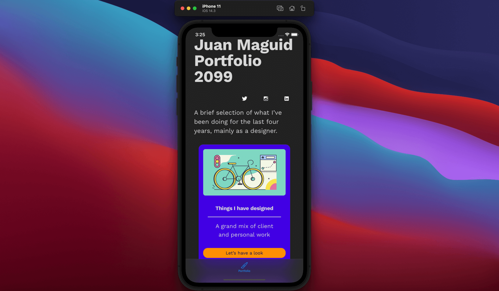
Let’s also look how our tab bar looks in dark mode. In your iOS simulator go to Settings 👉 Developer 👉Dark Appearance.
Let’s add a couple of more View Controllers
This would be a really lousy Tab Bar with only one tab right? Let’s fix this by adding two more View Controllers, you could call them Xcode artboards or frames, but that’s probably radically wrong so let’s not.
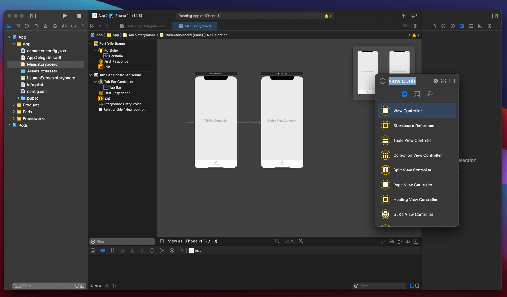
- Use the neat shortcut you learned in this tutorial to fire up the Library ⇧⌘L
- Search for View controller
- Add two of them to our Main.storyboard canvas
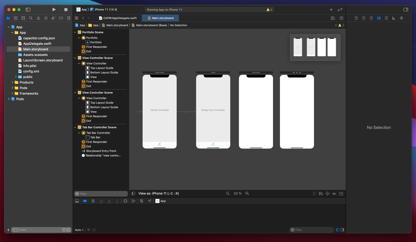
- Select the View Controller named Tab Bar Controller, hold down the Control button on your keyboard and drag out what’s called a segue. Really hard to show with just one picture so let’s look at a screen recording instead 🎞️
- In the little pop-up that appears make sure to select Relationship Segue 👉view controllers and boom just like that these views gets added to our Tab bar! Not only that, they are now linked together.
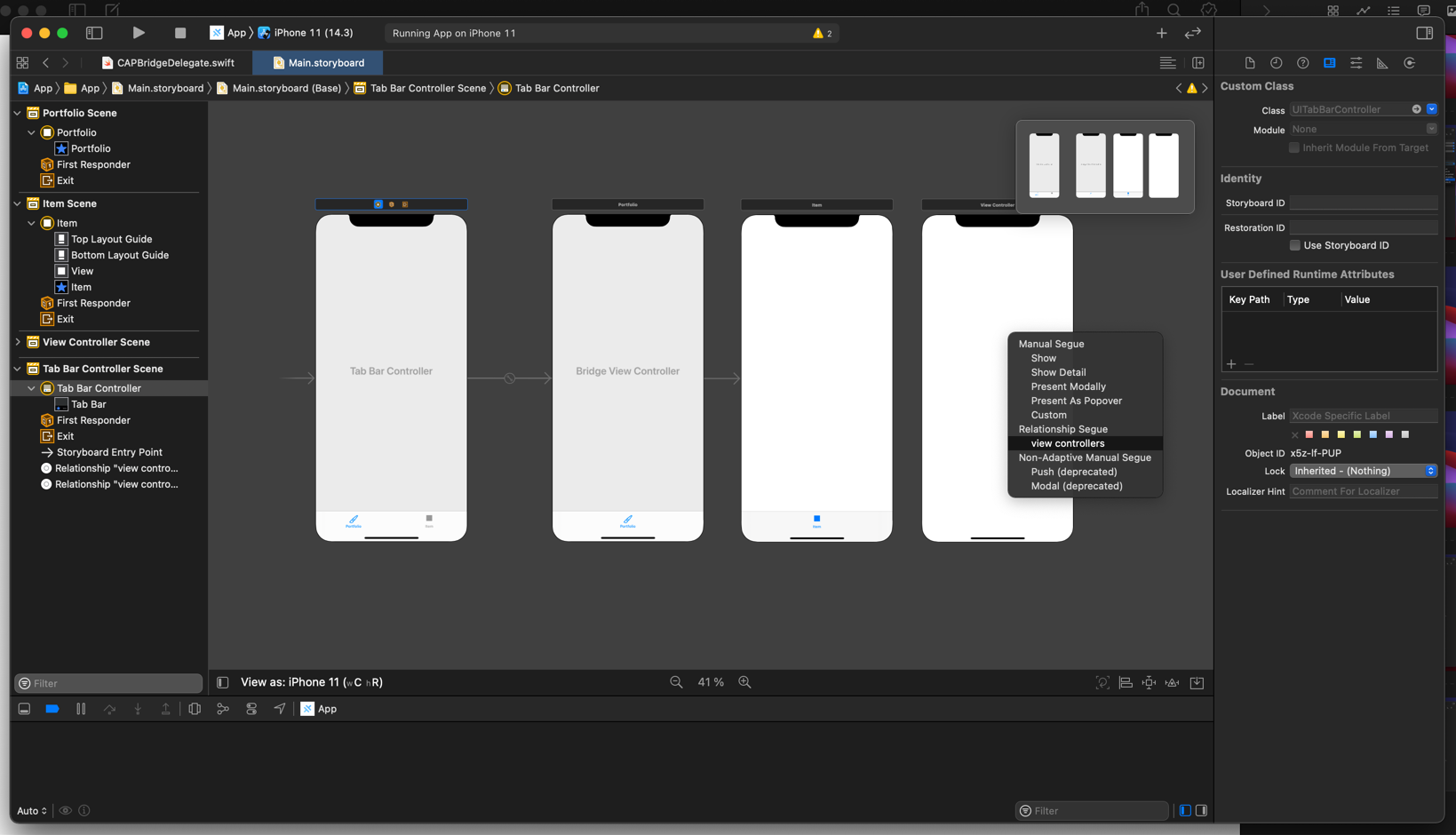
- Let’s redo what we did above, name our tabs, choose some nice icons and for clarity lets tint the other view controllers in some happy colors so that can keep them apart.
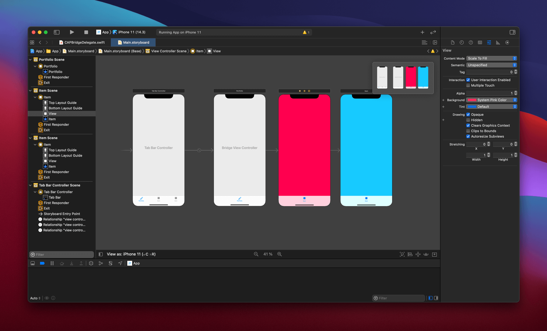
Final build for this tutorial
Let’s fire up yet another iOS simulator, put them side by side and amaze ourselves at the fact that you can build this, with minimal knowledge about Xcode. Yes, you will need to learn how to build for Sketch2React, but we have tons and tons of tutorials and written material about it. So, what are you waiting for?
See you next time
In our next tutorial on this very subject we will learn how to add something called WebKit View to our two tabs called Words and Tutorials, replacing those nice colors with actual embedded web content.
Until next time, have a great one!
