
Hey guys! ? This is a small detour from this tutorial that covered best practices for getting great morphing results for vector shapes. You can see this as a on-going series with the difference that I don’t have a clear view on how many of these I will create. ???
This one is even more hands-on. It’s a step-by-step Medium-only GIF-powered tutorial on how to create smooth typographic animations.
What we are going to create
You are going to create an animation with the word FUNKY with a beautiful free font called Funkturm. The reason I’ve choosen a very fat font is that you get a very fluid morphing effect that way. (And in my head I thought using a thinner font would look like crap. I’m probably totally wrong.)
You will need

Step 1. Create new document
Create a new document (⌘+N) in Keyshape. You can use one of the template sizes, no worries you can change all of this later. Actually it’s always a good idea to trim your canvas as much as possible before exporting your end animation to code.
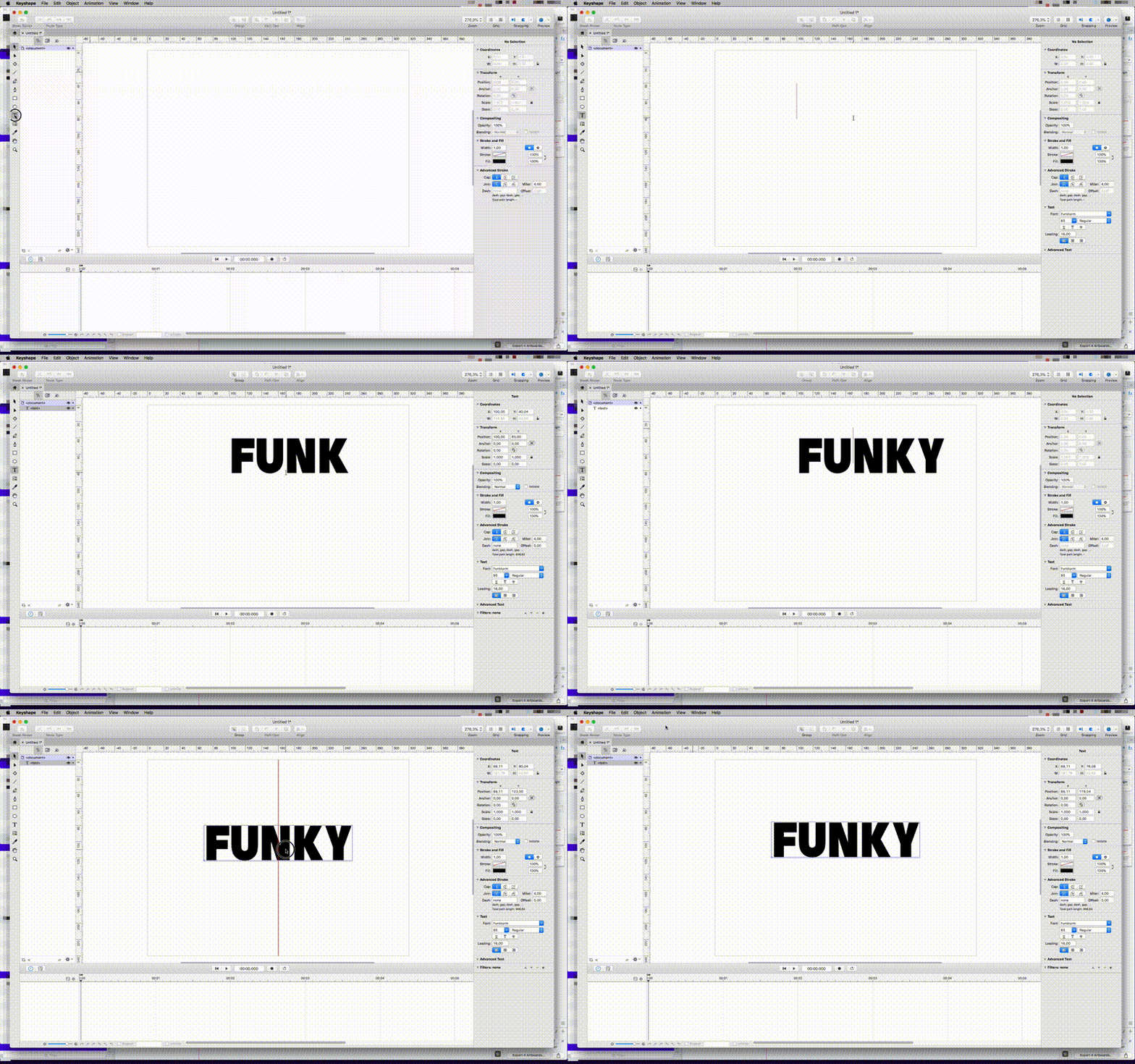
Step 2. Using the text tool
Use the Text tool (T) to write the word ”FUNKY” with capital letters using the font Funkturm. Of course you can write this with lowercase or another font. ?
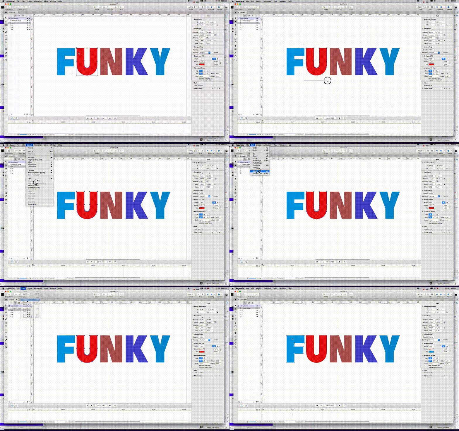
Step 3. Convert to path and break apart
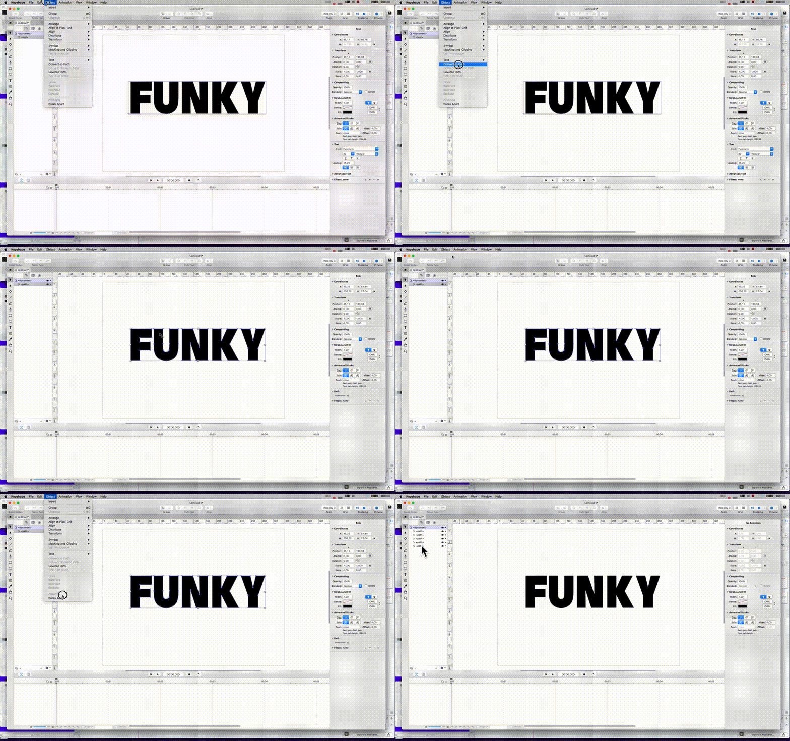
Next use the Selection tool (V) to select the word you just created. Go to Object→Convert to Path. That converts each character to editable vector content. Next, select the newly created <path> and Go to Object→Break Apart. That ungroups everything so that you can animate between each character. Make sure to name each <path> layer to something that makes more sense to you. For example ”F” ”U” ”N” etc etc ☺️
Step 3.5. Fix those anchor points
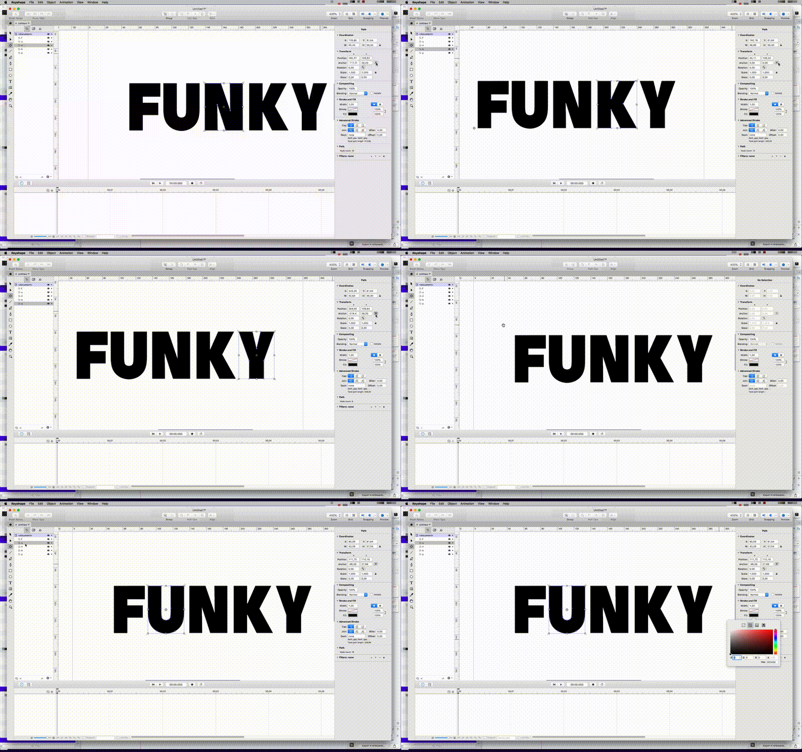
Make sure you have the anchor point of each character in the same place. Easiest (and I’m lazy man) is to just use the Transform Tool (T) and just move it to the center position.

Step 4. Color code your vectors
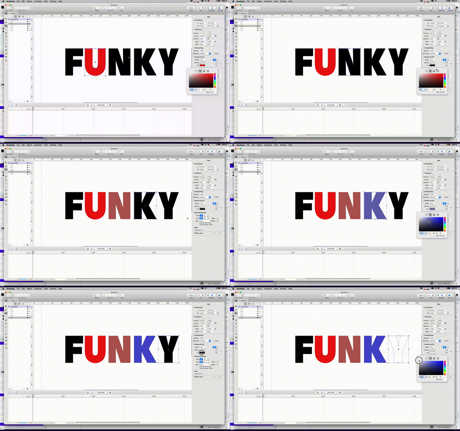
This is not mandatory just something I do to keep things more organized while animating. ?⭐️ Good to know: All of the shapes you paste into the first character will takeon that color.
Step 5. Copy shapes
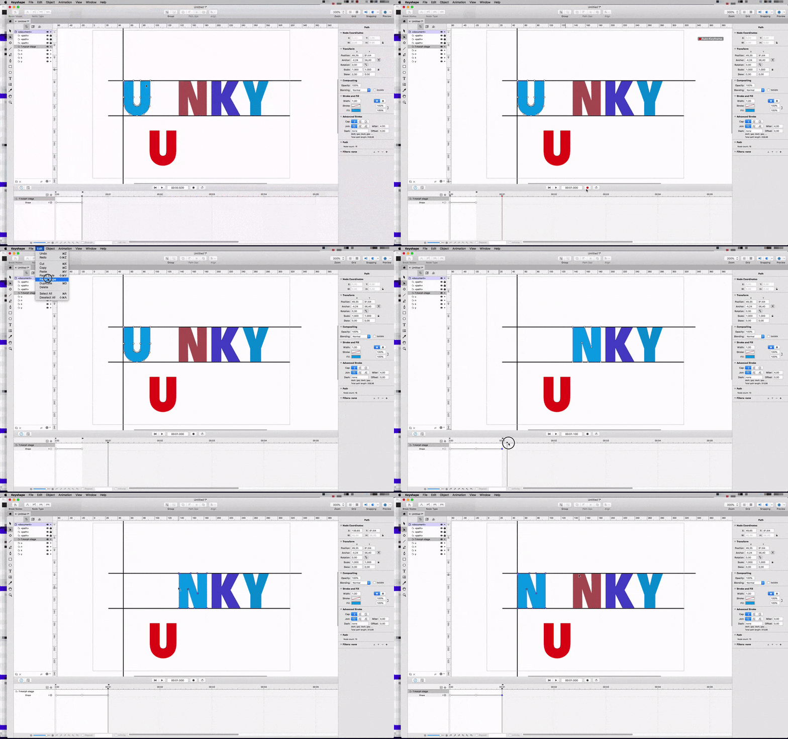
Select the Node tool (A) and use it to select all of the nodes inside of the ”U” character. Go to Edit→Copy
Step 6. Paste the ”U” shape into the ”F” shape
First make sure the Auto-Keyframing button is pressed and in a red active state. Then move the timeline cursor out a bit, half a second (00:00.500 or 5 frames depending on your document settings) is good enough right now. Go to Edit→Paste Shape
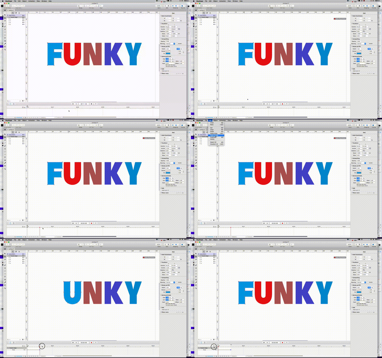
? Note: I created a workflow where I call the layer that will contain all of the animation/morphs to MorphStage. You can just ignore or just use it. It makes it easier for me to separate all of the layers/states in a composition.
Step 7. Align the morphed characters
What happens if you start animating right away like I did is that when morphed the character will of course move to the place in X and Y space where it was when copied. A very quick and easy fix is to: 1. Make sure the Auto-Keyframing button is turned off. 2. Select the morphed ”U” with the Node tool (A) and move it to where you want it to be, maybe left aligned onto the ”F”?

Step 8. Create manual rulers/guides
By now you may have understood that a ruler line would be nice eh? ? Since rulers/guides don’t work in Keyshape as I want them to (like in Sketch) you will need to create your own. Easy as pie just use the Line Tool (L).
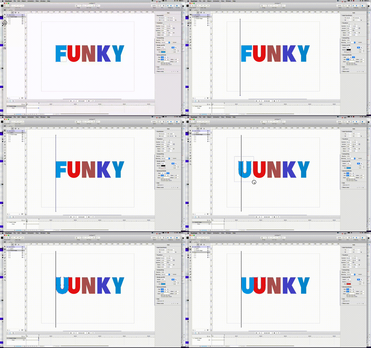
? Note: I asked the developer of Keyshape Pixofield if something like this would be included in a future update and guess what? Guides are coming!
Step 9. Experiment with Set Start Node
As explained in my last morphing tutorial one of the key things to get amazing morphing animations is to experiment with the position of the start node of each shape. If you’re getting wonky results it’s probably a good idea to play around with it. Just use the Node Tool (A) and select the shape and a very subtle bluish triangle will appear on one of the nodes.
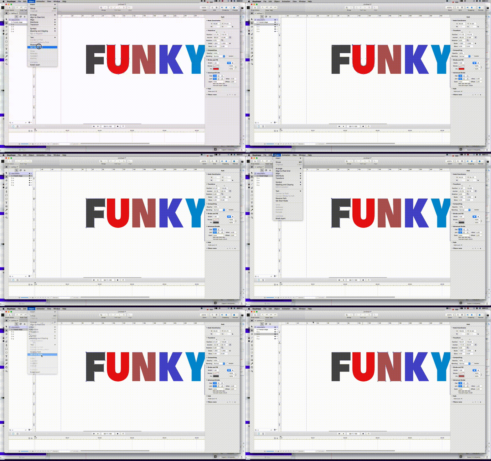
Step 10. Repeat repeat repeat! ?
As all things by repeating them many many times we get better and better. Feel free to leave me a comment on what was great and what was not so great, all feedback is appreciated. ????
Step 11. Final results

Download tutorial assets
GIFs are cool and all but to really see what’s going on you probably want to download the HD .mov versions of them. Plus you get the final version of the Keyshape project file as well to play around with.
Also here’s how the animation looks on my Codepen with some small additions like the gradient background. I’ll be doing a Keyshape →Codepen tutorial in the future, stay tuned.
Download the assets here
